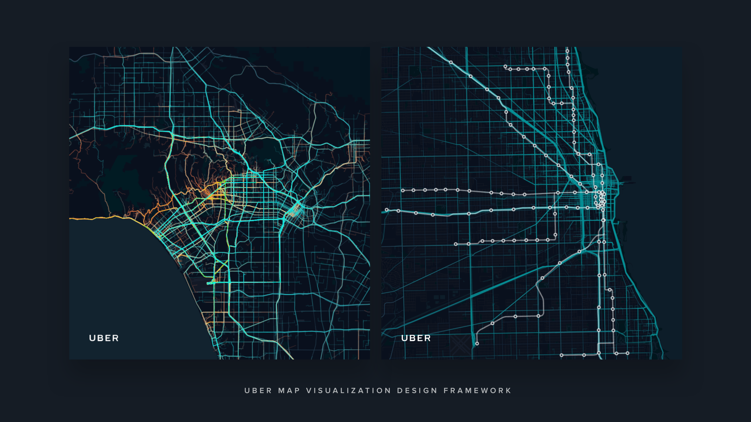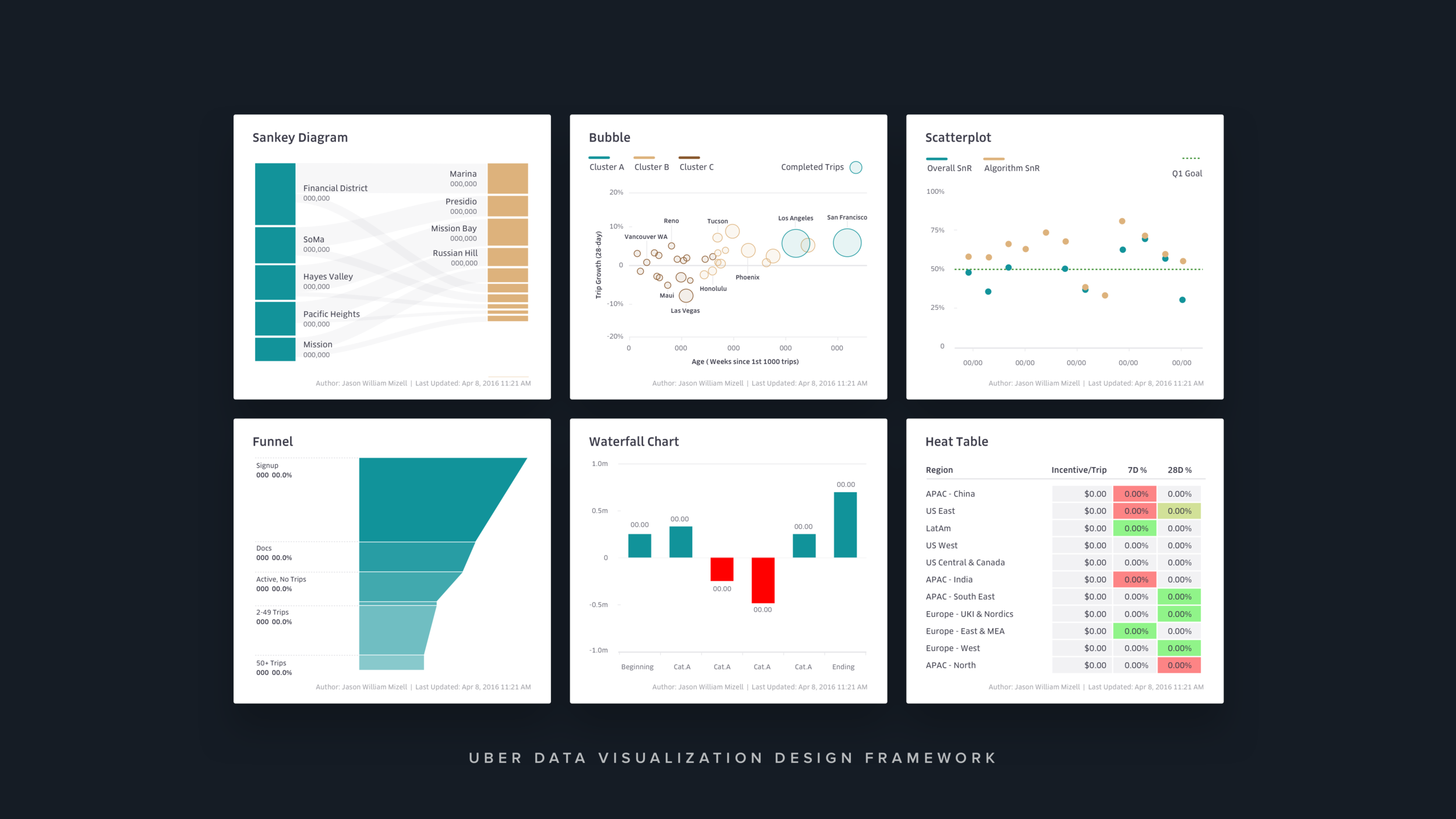
Data Visualization Design Framework
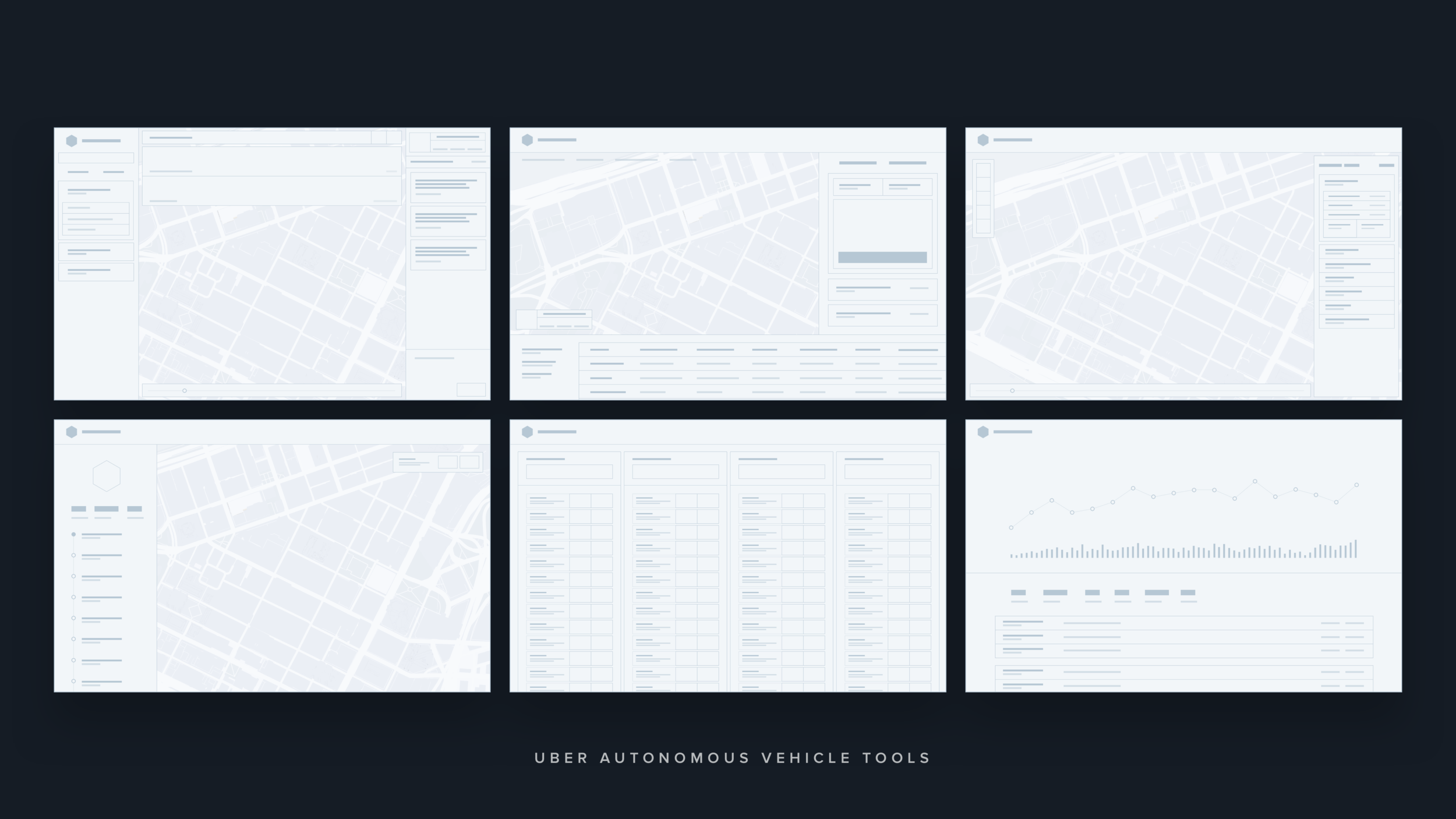
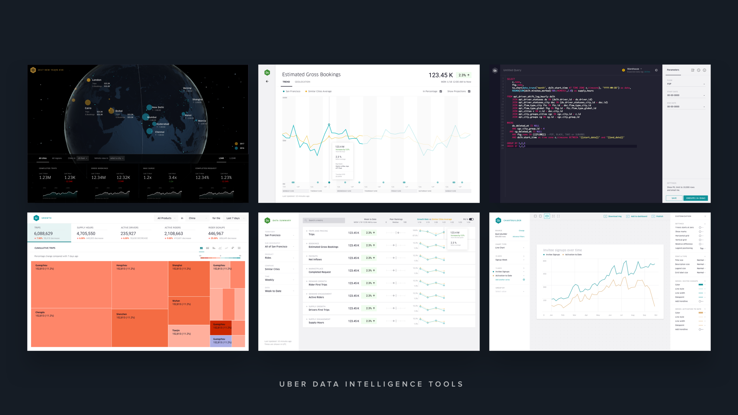
UBER have many teams across the organization exploring and producing charts and data visualizations for a wide range of needs. We create a unified system to guide the creation, presentation and exploration of charts/data visualization across UBER.
My Role
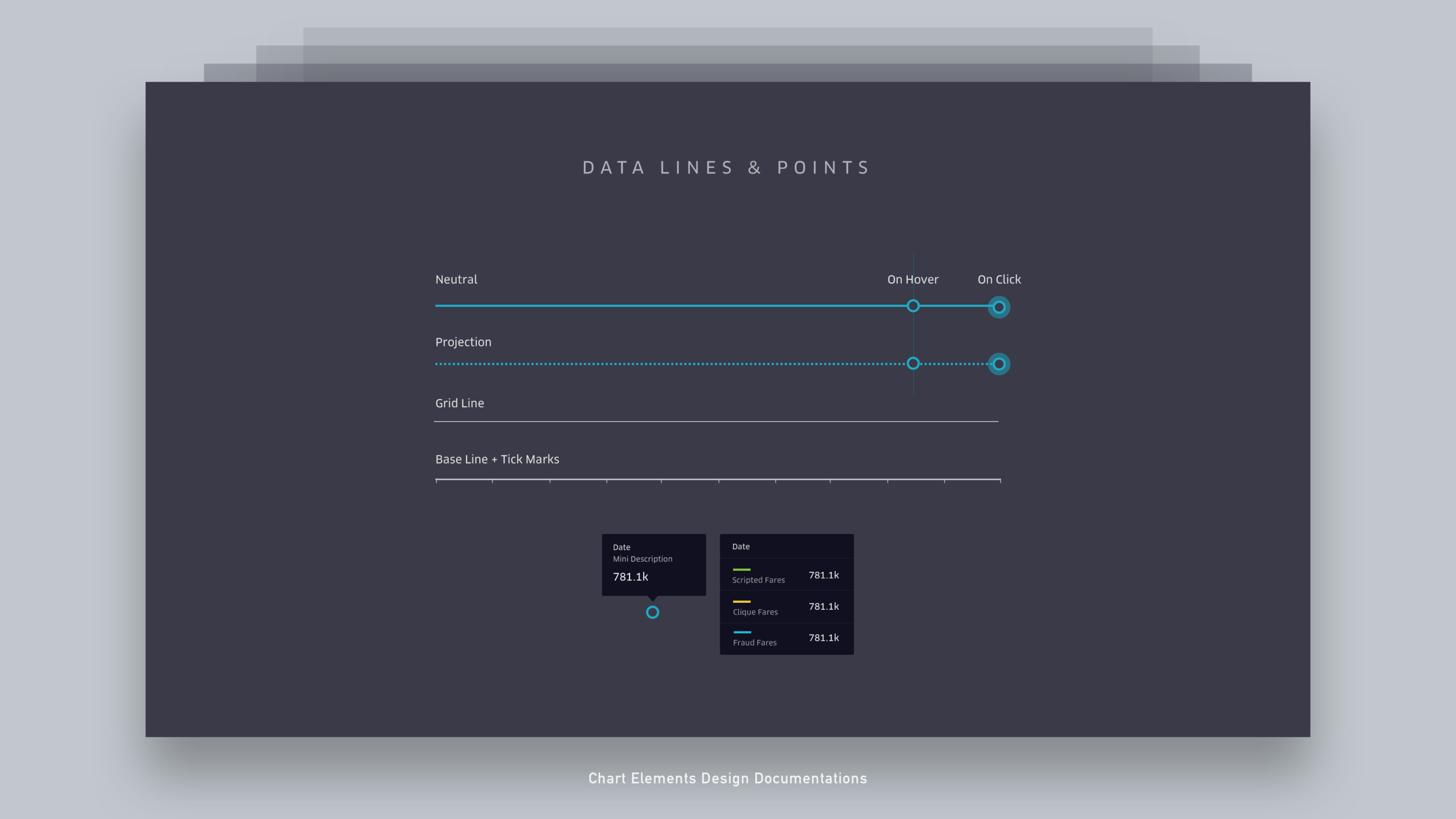
My main task was to translate multiple use cases and create a flexible visualization foundation and guidelines that can be used across the company. I’m responsible for the micro details which includes hover interactions, colors, typography sizes, opacity, line thickness and also the macro view such as how all the elements harmonize and makes sense together.
Tools used:
Querybuilder: An internal tool that I designed for UBER to get data from databases.
D3.js: Javascript library for manipulating documents based on data.
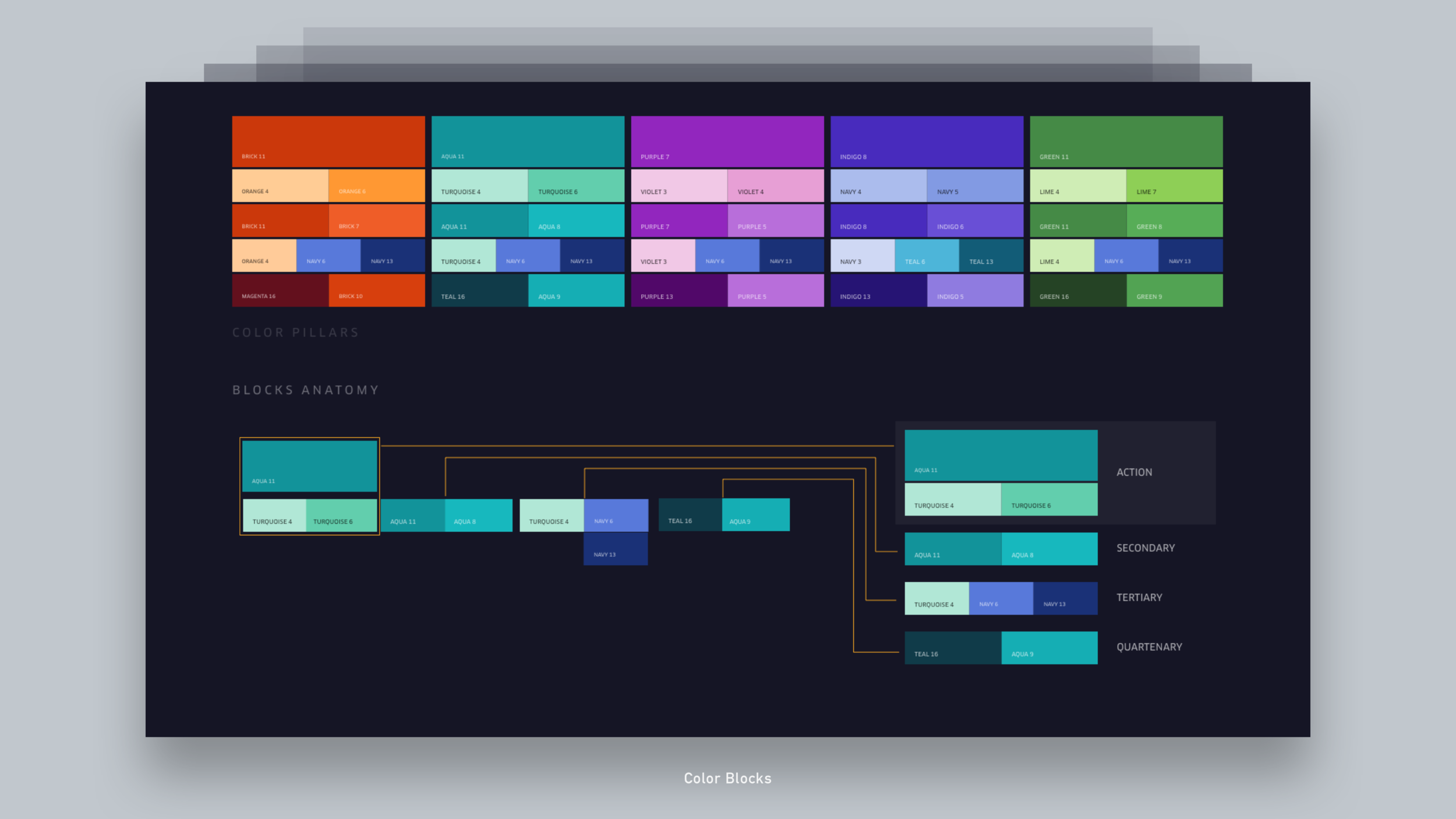
Chroma.js: To provide accurate color steps.
Colorbrewer.js: Tool for heap maps
Spectrum: Chrome extension plugin for color-blind testings.
Sketch: For visual fine tuning and documentations.
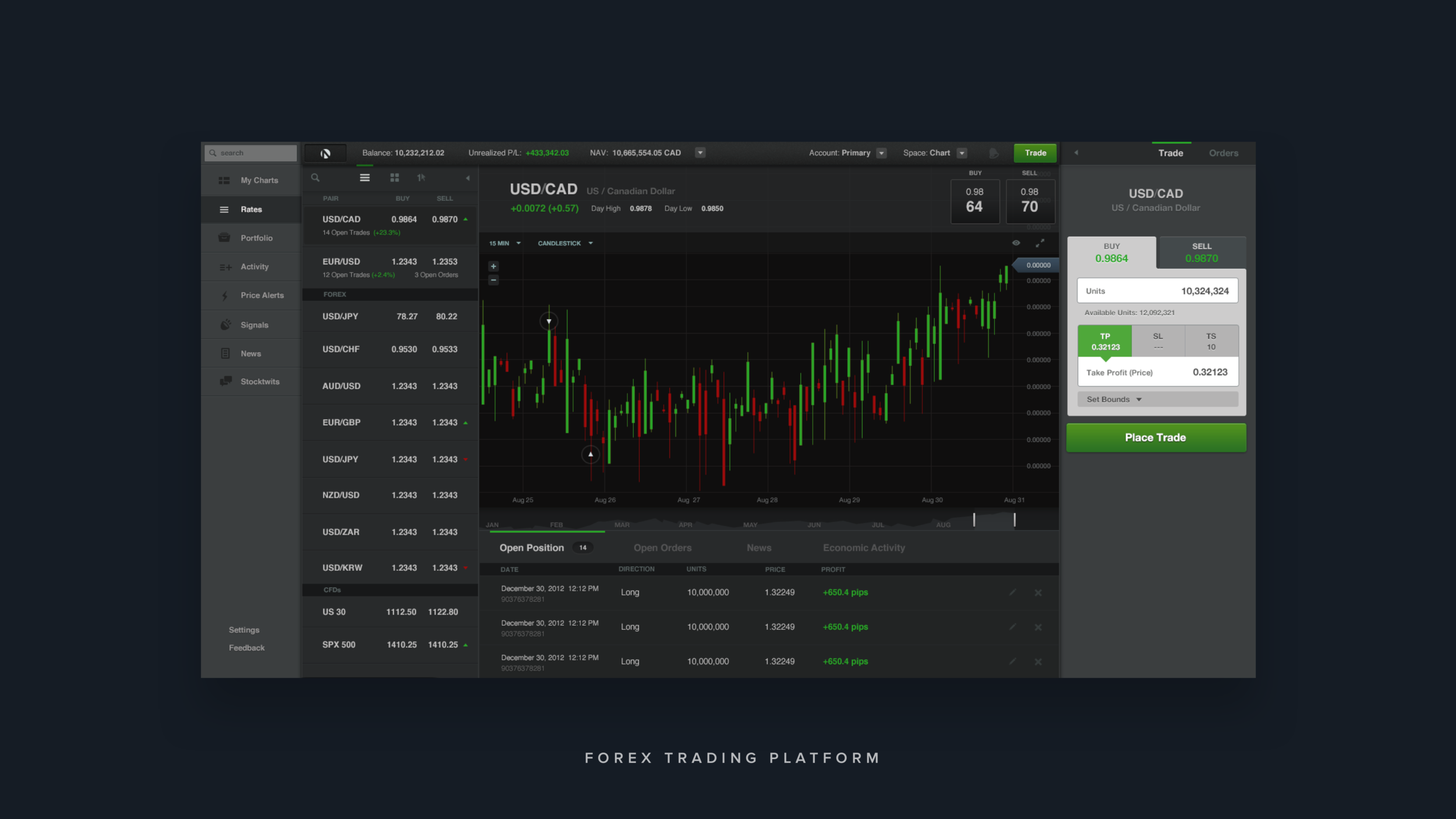
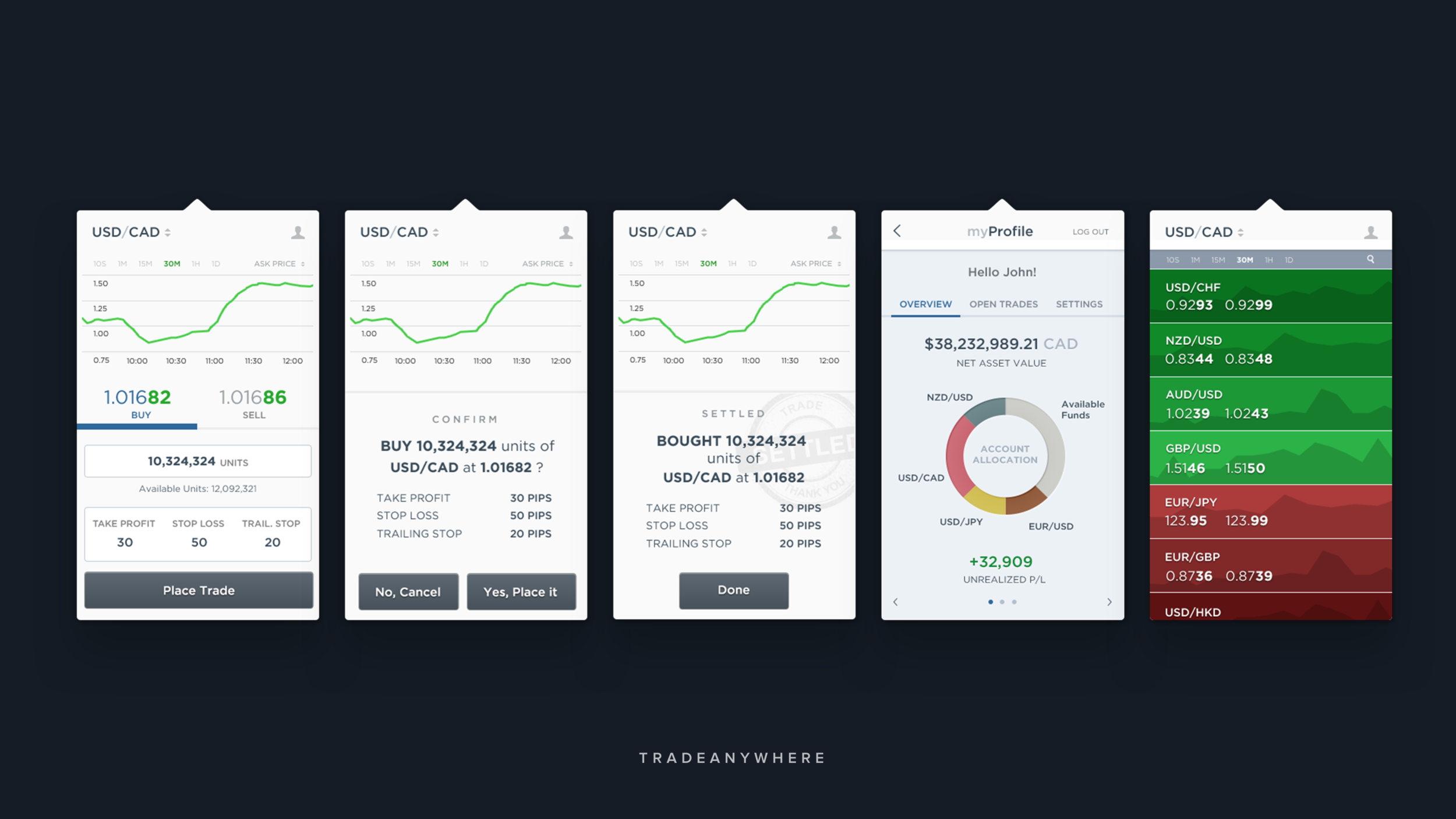
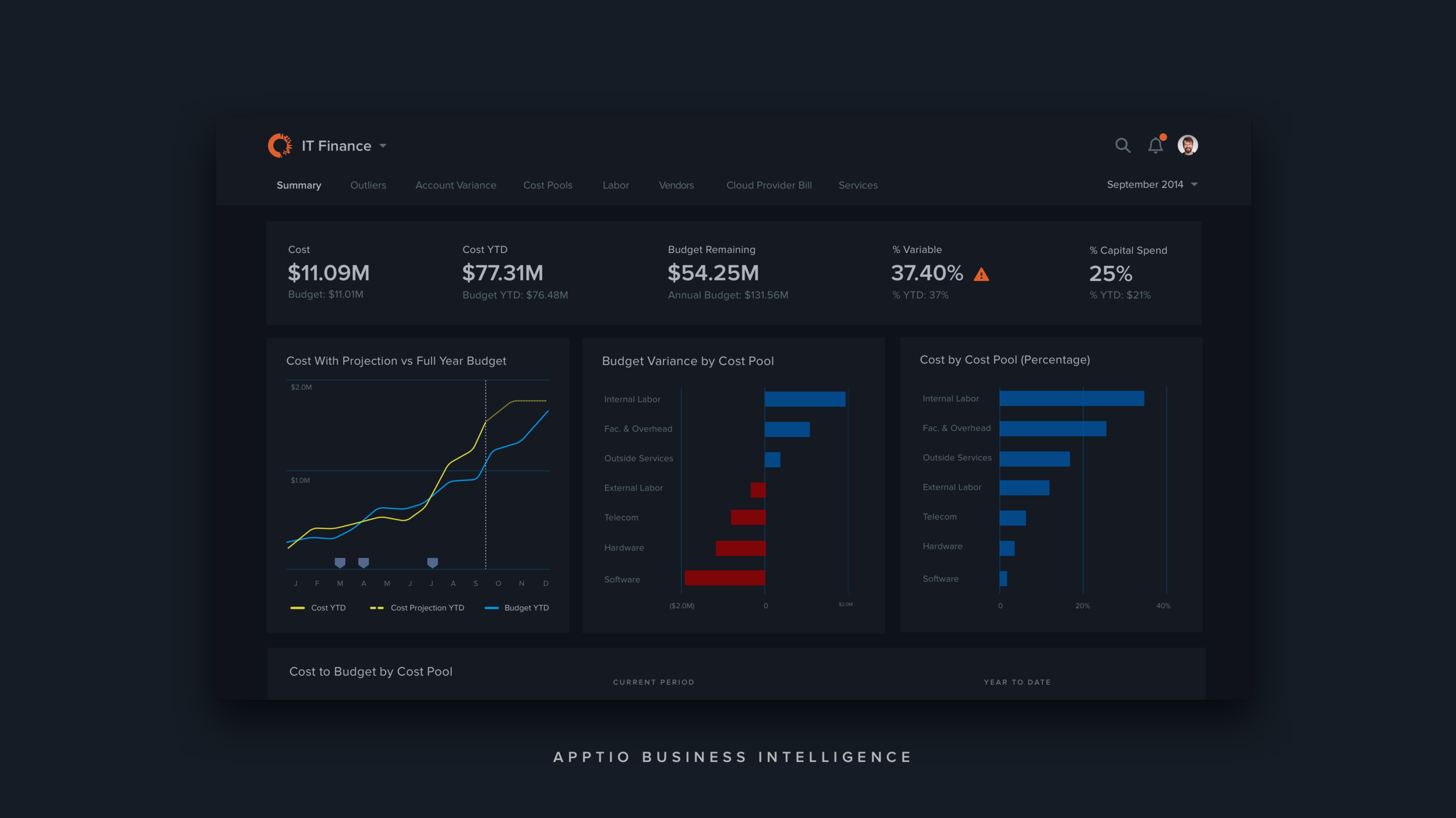
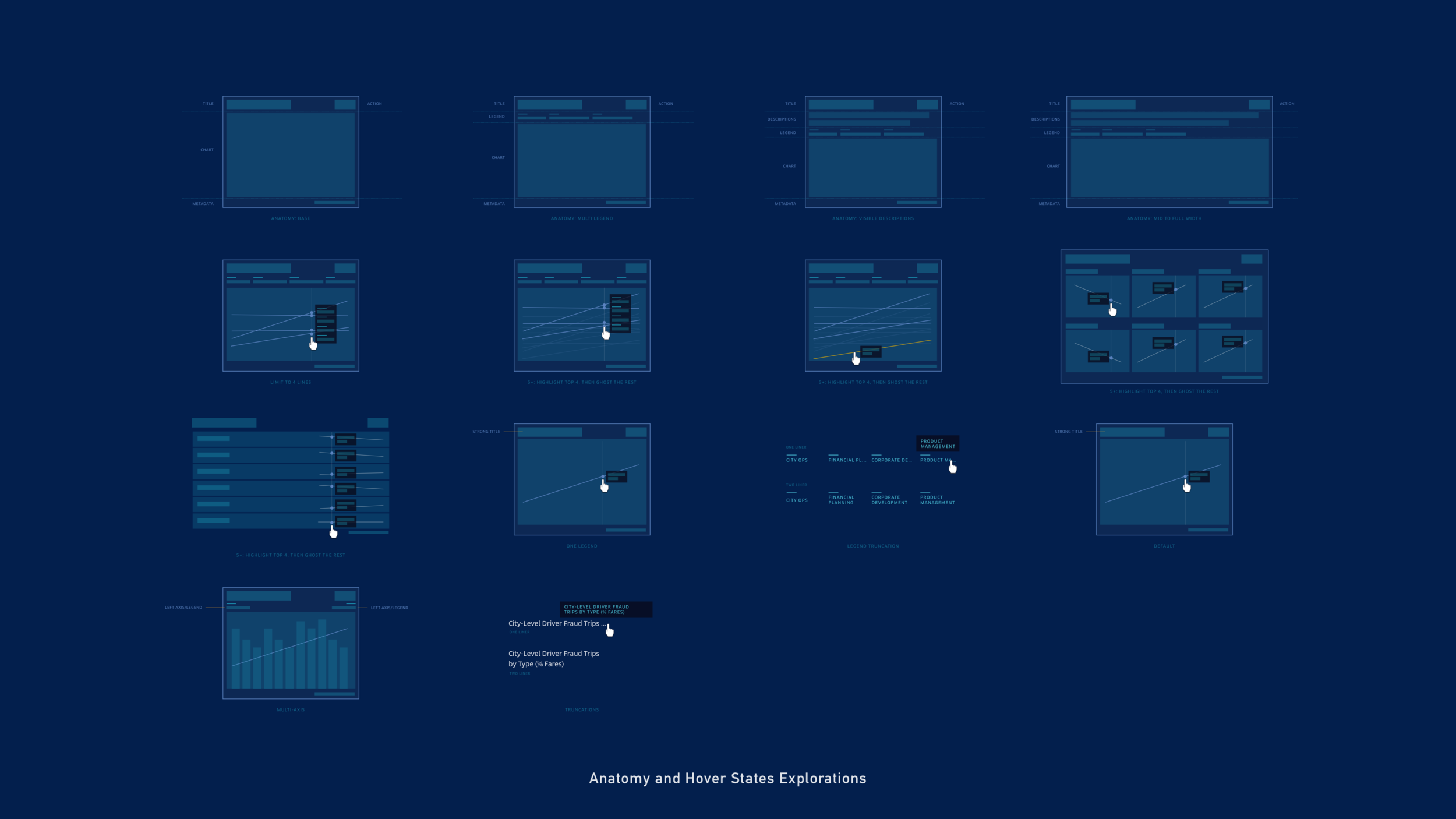
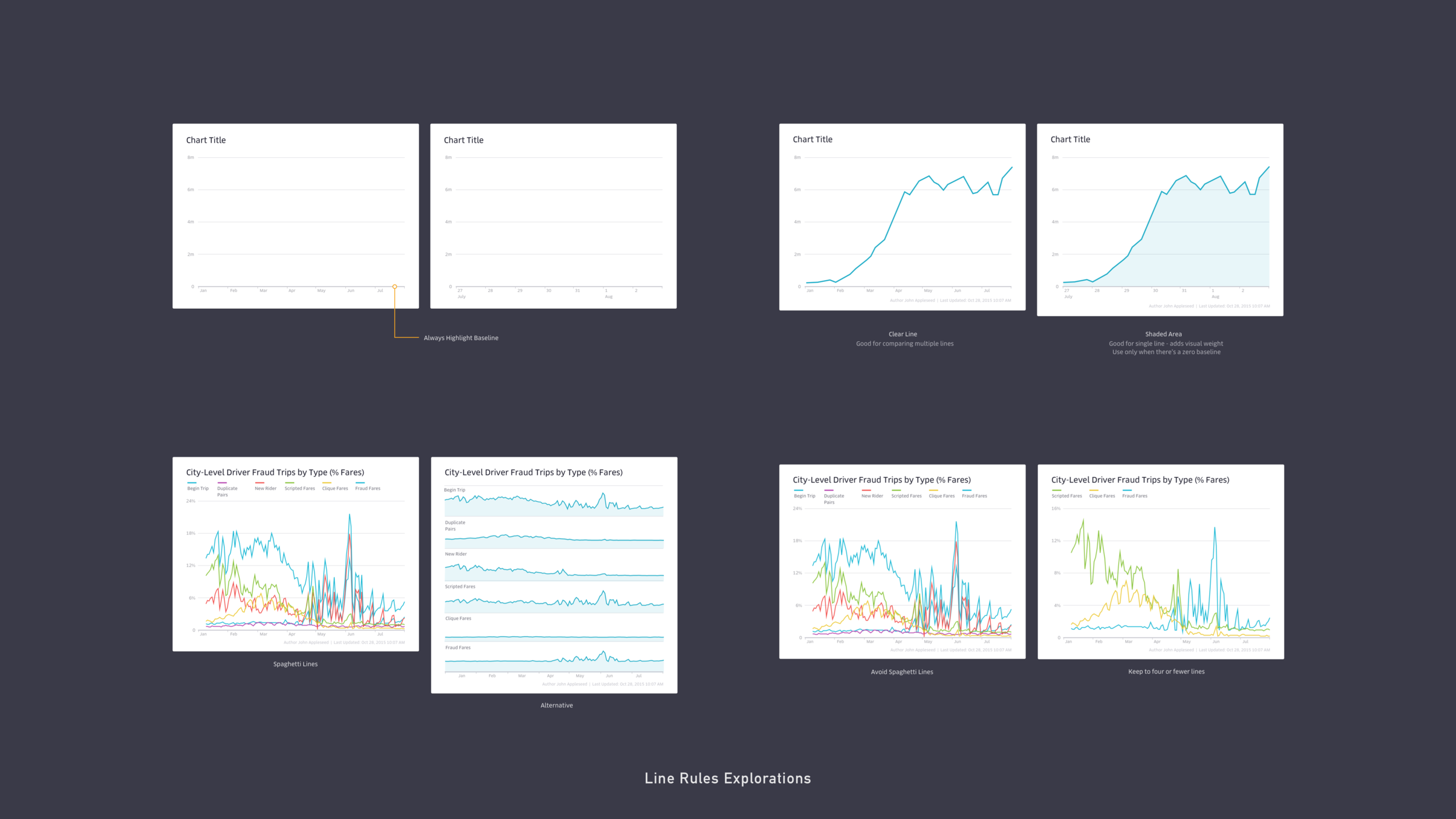
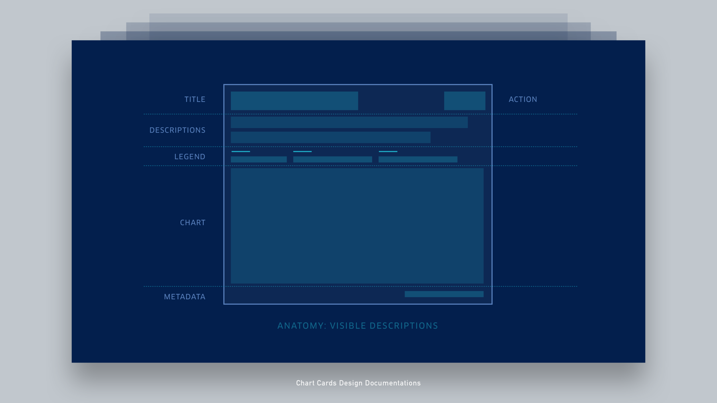
Behind the Scenes
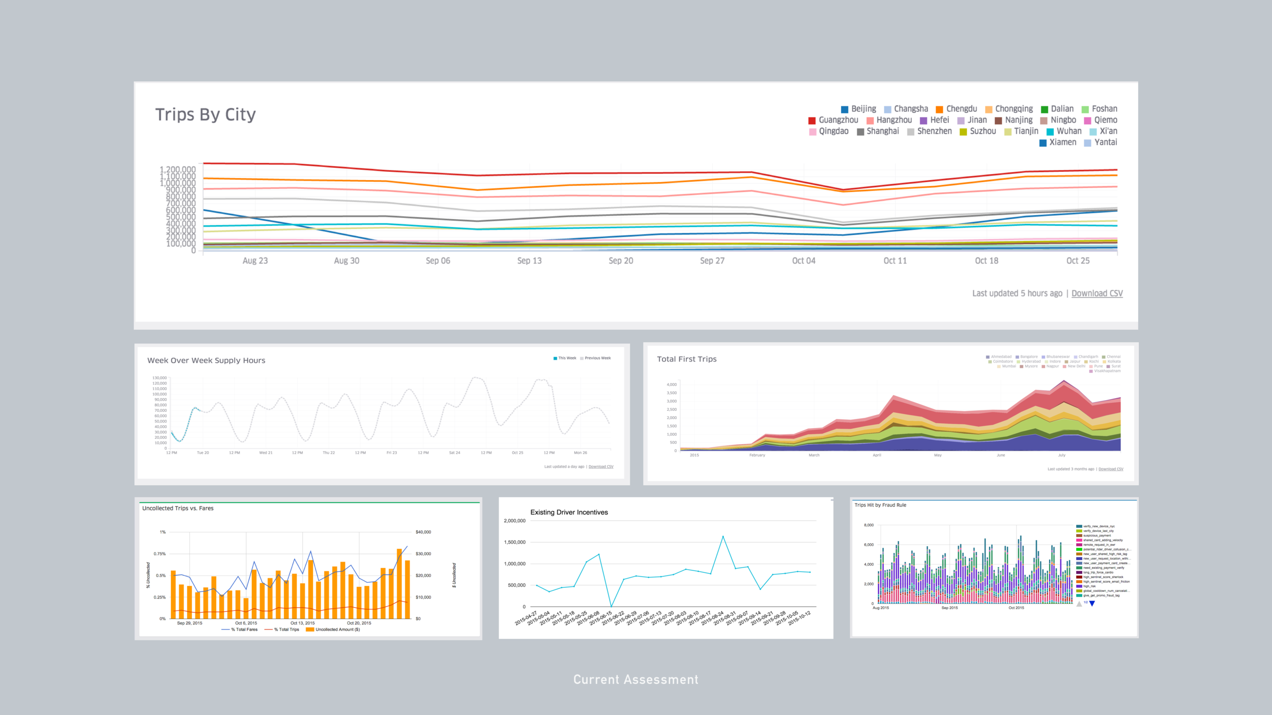

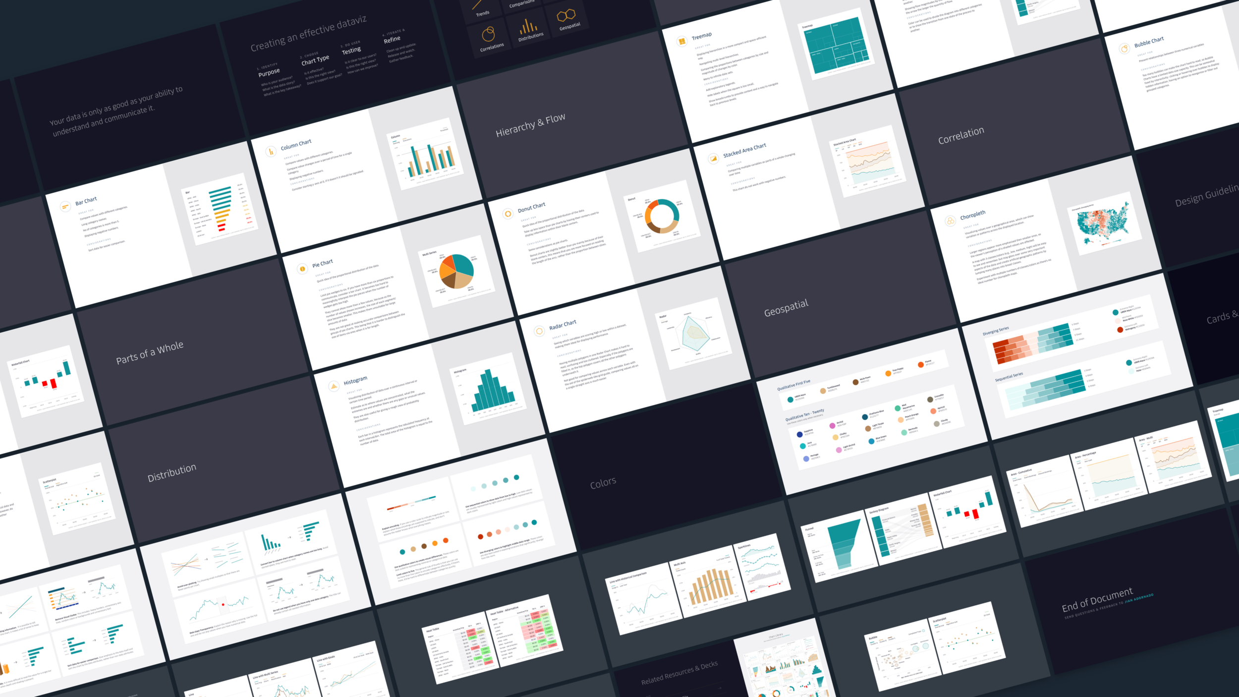
Final Product
Noteables
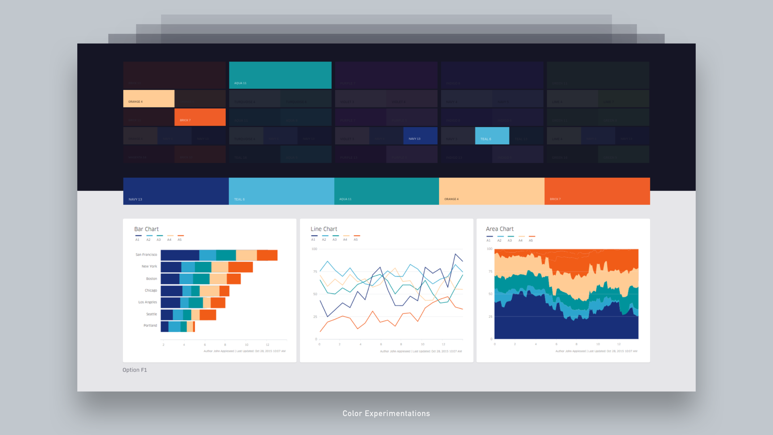
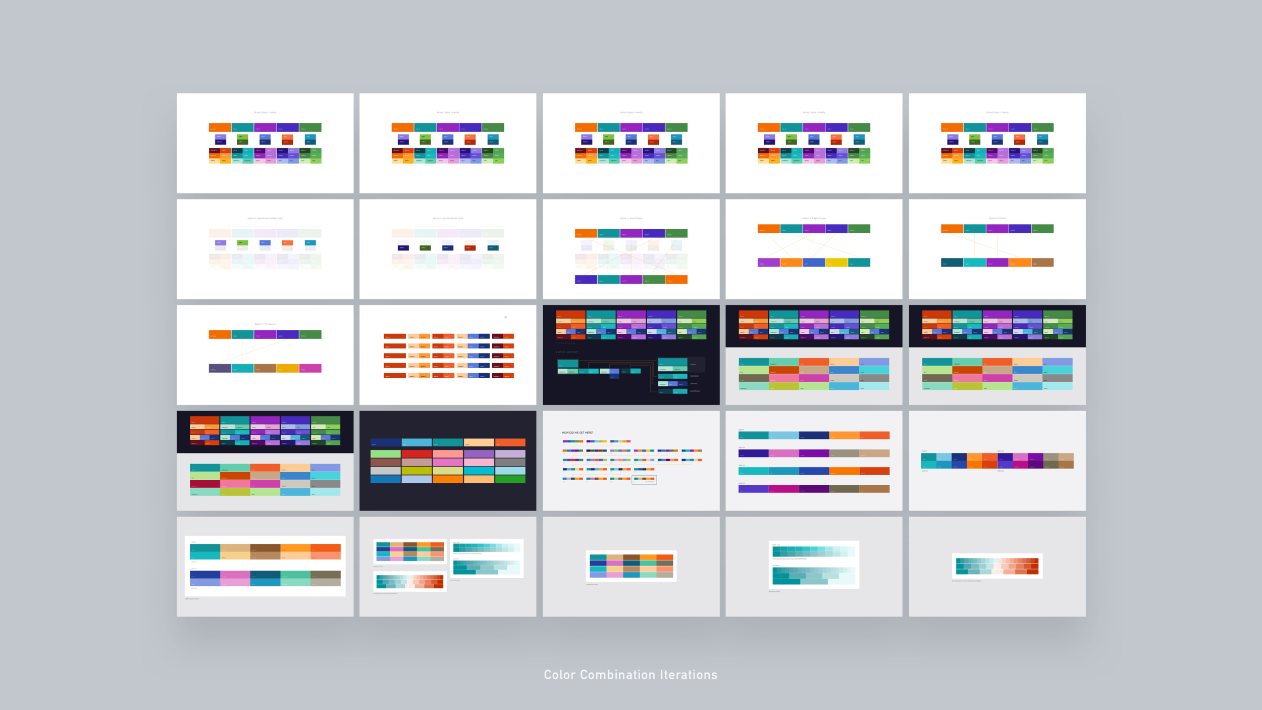
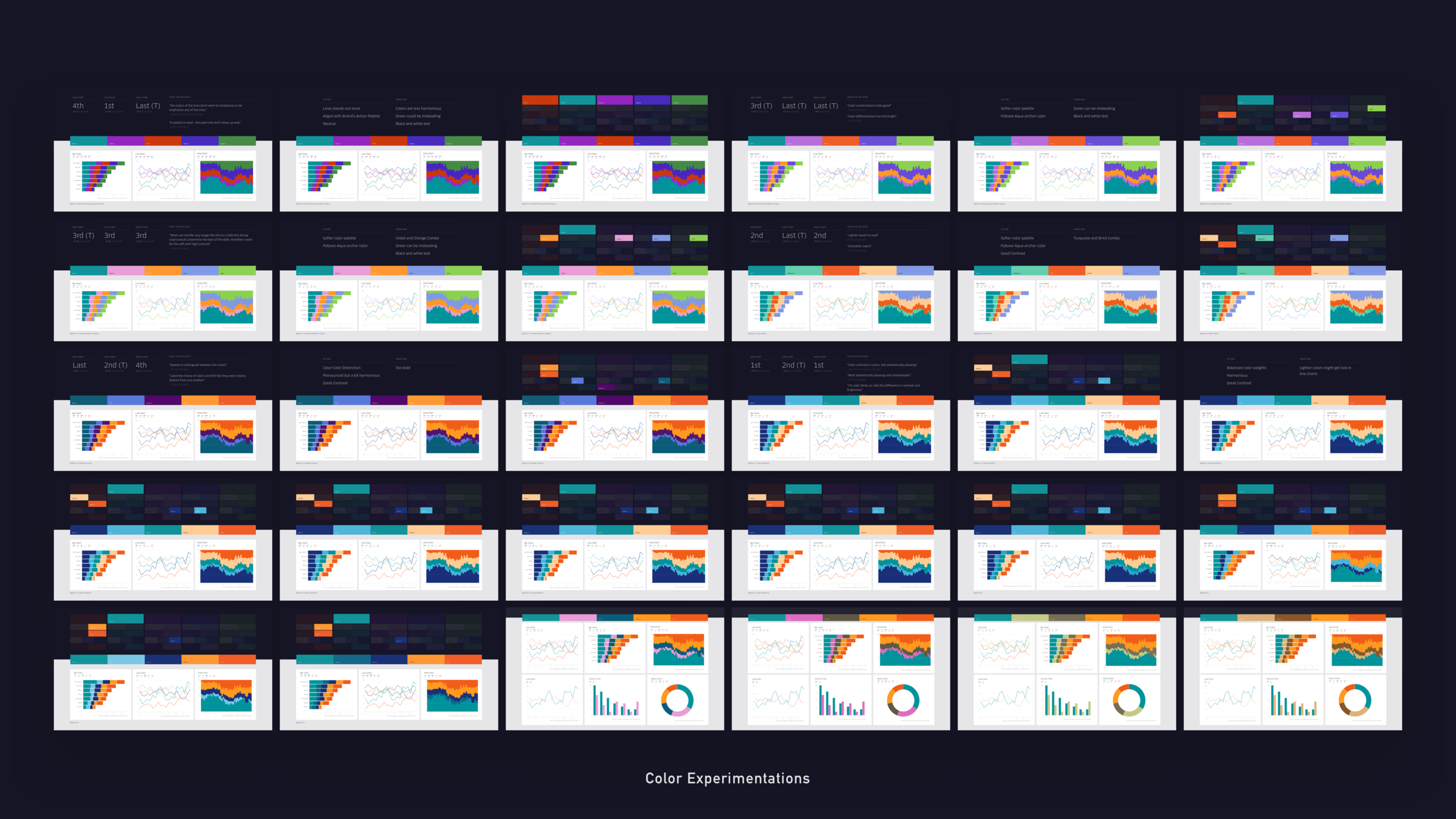
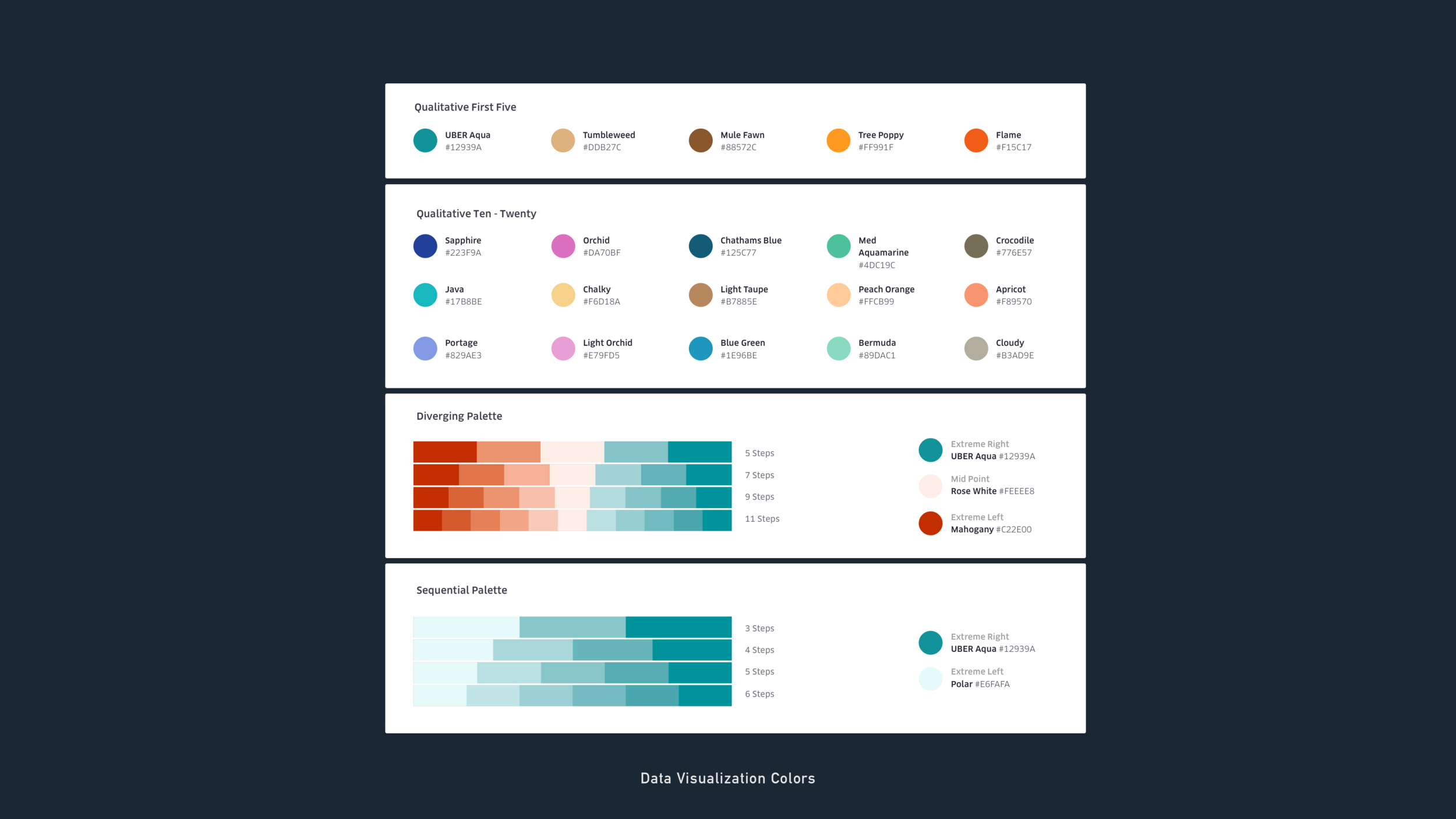
Went over more than 100+ color combinations ranging from contrast, progressions and hue variations.
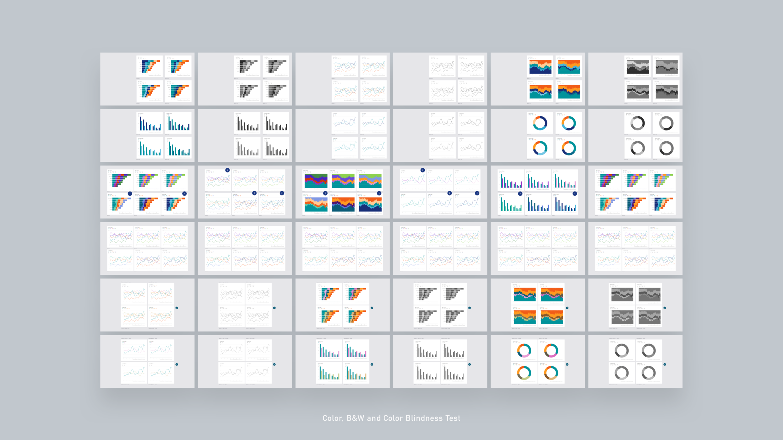
Stress tested to multiple scenarios such as colorblind, projector, black/white contrast and print test.
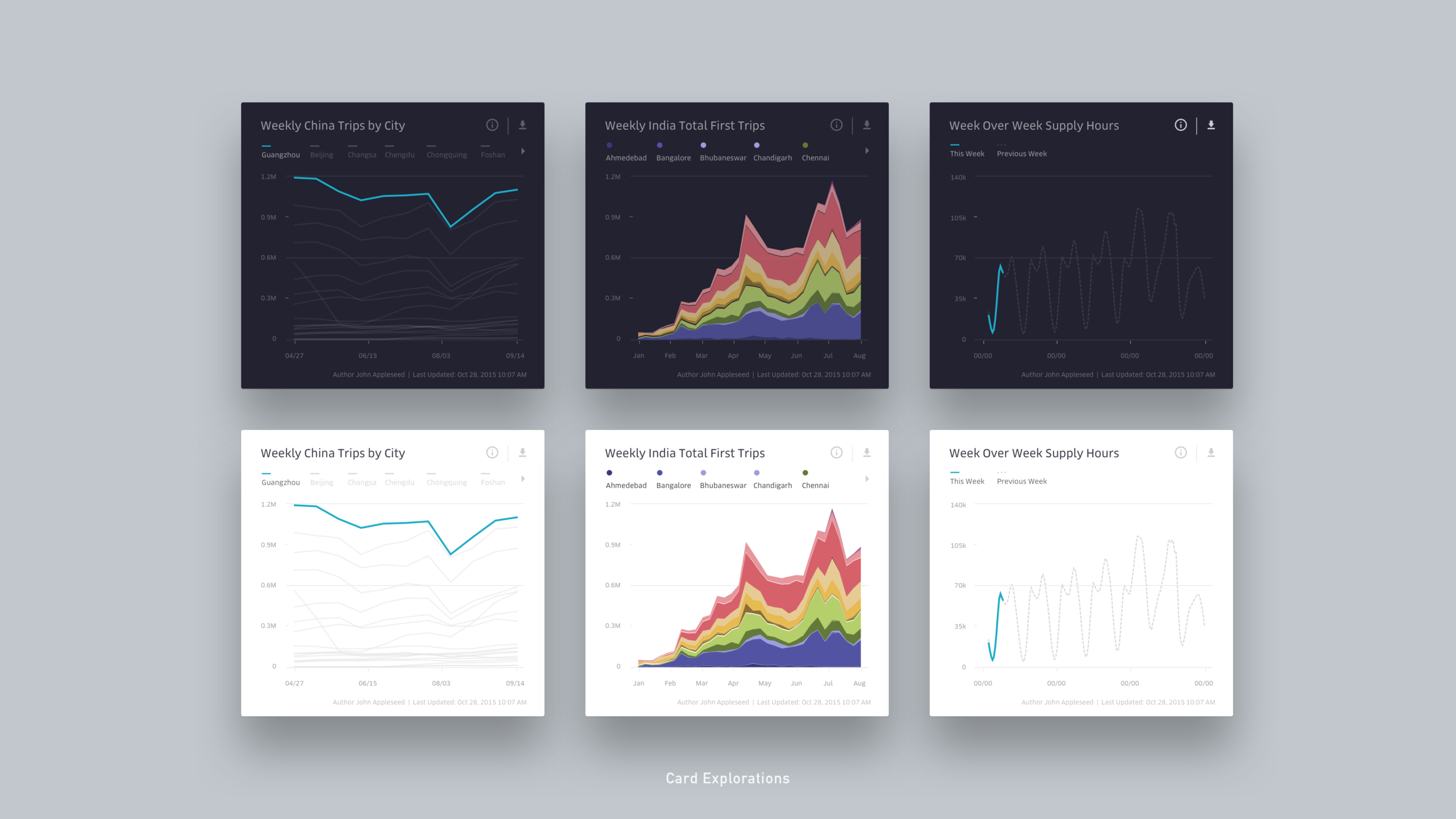
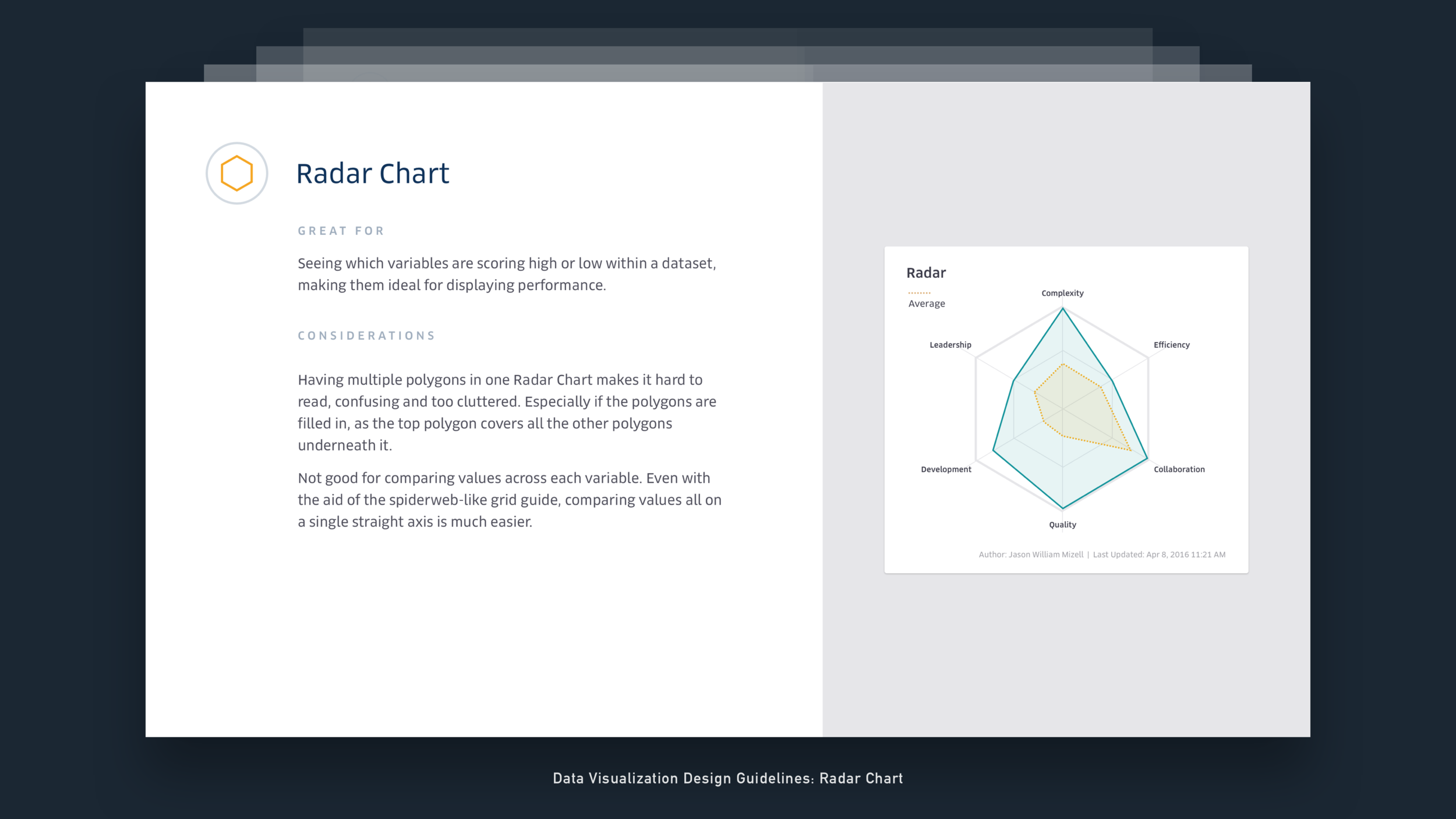
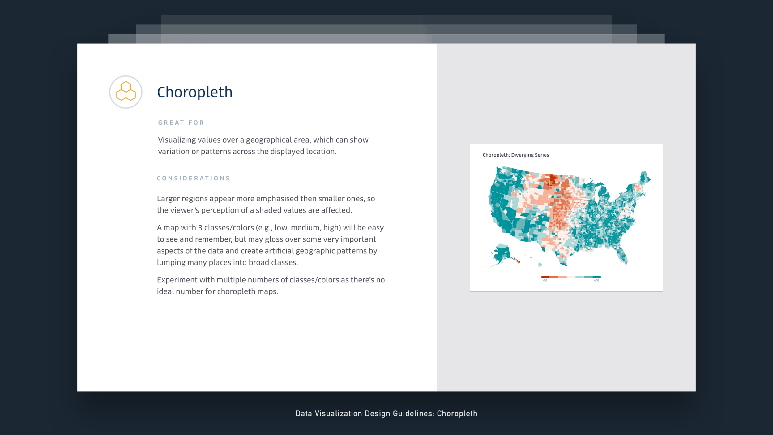
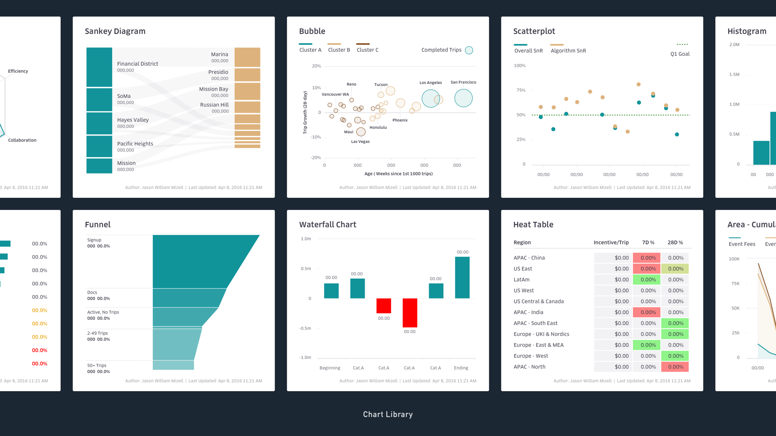
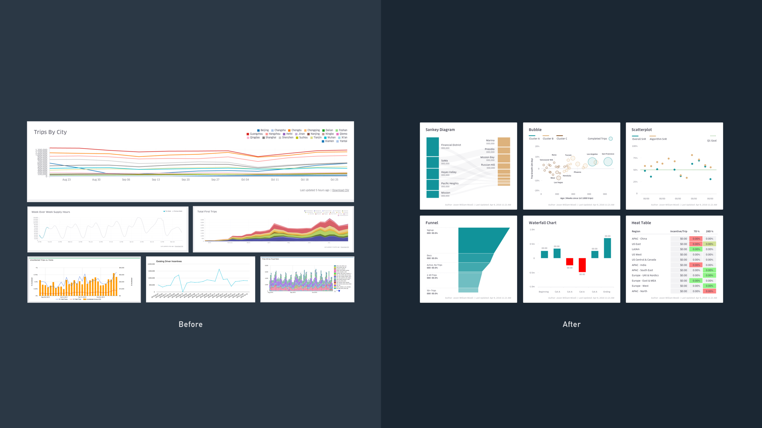
Covered multiple charting types along with its states and usage guides. Sketch templates were part of the deliverables.
Tackle critical use cases, such as presenting data vs exploring with data from a tooling perspective, this led to providing guidelines for axis lines, hovers and legends.
Want to learn more about this project?
Get into this project's details from its design process, explorations, several iterations and prototypes. Learn how the final design performed and how it helped the organization streamline workflow processes.
Other Works